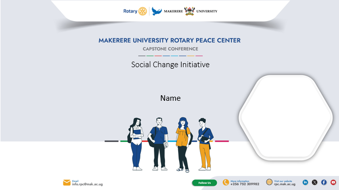
1. Logo Usage
-
Primary Logo: Always use the official Makerere University Rotary Peace Center logo in full color whenever possible.
-
Clear Space: Maintain at least the height of the Rotary wheel as clear space around the logo to ensure visibility.
-
Minimum Size: Do not reproduce the logo smaller than 2 cm in width for print or 100 px for digital use.
-
Backgrounds: Use the logo on white or light backgrounds only for clarity
-
Do not:
-
Stretch, distort, crop, or alter the logo colors.
-
Place the logo on busy or patterned backgrounds.
-
Add effects (shadows, glows, or outlines).
-
2. Colors
Use the approved Makerere University and Rotary brand colors for harmony and consistency.
Primary (main colors)
- Blue #18498a
- Yellow #efa31f
Secondary ( used sparingly)
- Charcoal #45474e
- Green #0f9548
- Red #e52b2c
- Sky blue #04abdf
- Deep blue #0d62a8
- Pink #d41b61
![]()
3. Typography
Use clean, professional, and legible typefaces.
-
Primary Font: Barlow (for headings and subheadings)
-
Secondary Font: Calibri or Roboto (for body text)
-
Maintain consistent font sizes, weights, and colors across all materials.
-
Avoid decorative or script fonts in official documents or promotional materials.
4. Tone of Voice
The Mak RPC voice should reflect:
-
Professionalism — scholarly, credible, and respectful.
-
Peacebuilding Values — compassionate, inclusive, and inspiring.
-
Clarity — simple, direct, and accessible language.
-
Global Outlook — reflecting international collaboration and impact.
Use positive and action-oriented language that highlights peace, leadership, and service.
5. Imagery
-
Use high-quality images that reflect diversity, peacebuilding, collaboration, and the Makerere environment.
-
Use original or approved photos.
-
Always obtain consent for identifiable individuals.

